Designing a Website Around Customer Intention

Before we dive into the topic above, I want you to think of some recent purchases you made, whether they were online or in a store. Did you know the exact product you were going to buy? Were there times you were planning on purchasing a type of product, but weren’t sure exactly which one you would take home? Or did you have a need or problem to solve, but no idea how you were going to solve it?
I think it’s fair to say that we’ve all experienced each of these scenarios at some point in time. Now let’s expand on this exercise by thinking about any of those experiences that resulted in a negative outcome. Here are a few examples of what I mean:
“I went to the local big box DIY store to buy a new DeWalt drill, but when I got there to make the purchase, I couldn’t find the model I was looking for. When I finally did, they were out of stock.”
“Our vacuum broke so I went online to buy a new one, but I wasn’t sure which one was right for our family. I searched Google for “vacuum reviews and comparisons”. The first link I clicked on just showed me a bunch of vacuum cleaners with prices and promotions they were running. I was overwhelmed because they all looked the same to me, so I left.”
“Water is leaking under my sink. I don’t want to pay a plumber because I am fairly handy, but I have no experience doing a job like this. I went to a plumbing website, but all I could find were a bunch of parts that I am completely unfamiliar with.”
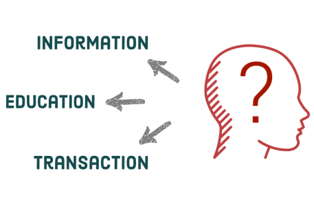
You’re probably wondering, “What’s the point of all of this?” Well, it’s to clarify the different intentions consumers have throughout the buying process. Understanding YOUR customers’ intentions can have a huge impact on your core ecommerce goals and metrics. Here’s how…
Website Design and Customer Intent Satisfaction
Designing a website around each of the core customer intentions involves a few key elements:
- Understanding who your customers are - Knowing your customers and target audience helps you to create relevant content in the correct voice that connects with them.
- Knowing what your customers’ intentions are - This involves understanding their intention by analyzing data and behavior patterns.
- Providing the correct information, content, and CTAs to meet their intentions - Correctly organizing site structure and content for each user intention.
- Finally, after giving them the correct information or content to meet their intentions, gently but clearly guide them further down the path to purchase so they can eventually convert.

Informational
These are customers who are interested in your brand’s products and services or your company in general. The main driving force behind their intent is to find more information about your products or services to aid them in their purchase decision. This includes elements like your company’s history, processes, product specifications, product reviews, etc.
Educational
These potential customers have a specific need or problem to solve. At this point, they are looking for a specific solution by researching and considering different options. The main driving force behind their intent is to learn more about possible industry-related products or solutions, but are not necessarily interested in learning specifically about your company or your products.
Transactional
These users visit your website with a specific product in mind. They know exactly what they want to buy, and their main driving force is to make that purchase (or convert). In most cases, this type of user is the most valuable to your business because they need little to no naturing and convert at the highest rate. It’s vital to give these users a straightforward, clear and easy purchase experience via your site layout, navigation, and shopping cart.
Using Intent in Your Design
Now that we understand the 3 core types of users coming to your website, we need to design around this information to satisfy their intent.
Designing for Informational Intent
Since these users are driven by research, Resource sections can be very helpful to them. These sections can include how-to guides, tutorials, whitepapers, ebooks, and other similar content.
A regularly updated blog or news section is also a great way to publish industry-related content for users with educational intent. If you can establish your company as leaders in your industry, deriving sales from educational users will be much easier in the future.
Remember to use these pages to give your visitors information, not to push sales or talk about your products or services. Once users with educational intent see you are an expert in your industry, they should naturally gravitate toward other conversion oriented pages.
Designing for Educational Intent
Since these users are driven by research, Resource sections can be very helpful to them. These sections can include how-to guides, tutorials, whitepapers, ebooks, and other similar content.
A regularly updated blog or news section is also a great way to publish industry-related content for users with educational intent. If you can establish your company as leaders in your industry, deriving sales from educational users will be much easier in the future.
Remember to use these pages to give your visitors information, not to push sales or talk about your products or services. Once users with educational intent see you are an expert in your industry, they should naturally gravitate toward other conversion oriented pages.
Designing for Transactional Intent
The key to designing for transactional users is providing clear paths to products with an easy and quick checkout process. Your shopping cart should have minimal steps, and you should always allow your users to checkout as guests to further speed up the process, especially if they’re not interested in creating an account.
It’s also vital to design your homepage in a way where users clearly understand the next steps they need to take. Navigation and site structure is also extremely important. Be sure your products and categories are clearly organized and labeled so they can be easily found.
User Intent in SEO, Google Search & Content
We understand how important user intent is related to our website’s design, but it doesn’t stop there. With a bit of research and analysis, you can also improve your SEO and website metrics by giving organic visitors the right content based on the keywords they used in search engines to find your webpages. Here are some tips:
- Keywords can give you a lot of information about a user’s intent. Use tools such as Google Analytics, Search Console, SEMRush, Moz, etc. to analyze the keywords bringing visitors to your website and what pages they are landing on when searching those keywords.
- Keywords including your product names or company name likely have an informational intent, so they should ideally bring visitors to product reviews or to your About Us page. Optimize these pages for branded terms that bring the most traffic to your website to ensure the people searching arrive at the correct content they’re looking for. Hopefully since informational searches commonly use your brand and products, this should be fairly natural.
- When you are creating content for users with educational intent, do a bit of keyword research prior to writing so you understand common terms people are actively searching for. This will help your new content show up in Google’s search results as well as bring visitors to that relevant content.
- Transactional users should ideally land on the products they’re interested in, but this isn’t always the case. This is why a well-organized navigation menu is important. They need to be able to easily find what they want to buy.
- It’s always a good idea to write your content so that it is easy to digest, allowing readers to skim through and find the information they’re looking for. Sub-headlines, visuals and bullets can be used to separate content so it’s not laid out in big blocks or paragraphs. Also consider bolding or italicizing important phrases.
- Use your metrics and understand what pages your visitors are landing on and where they are going. If a high percentage of visitors are landing on a few select pages, concentrate on these pages first. If your bounce rate is high on these pages, it’s likely that the content on the page is not satisfying their intent.
Homepage Design
Think of your homepage like a traffic cop. Obviously, your homepage needs to grab the attention of visitors within the first 5 to 10 seconds and clearly display what it is your company does, but it’s also very important that your homepage directs visitors to the content that matches their intent.
If the bounce rate on your homepage is higher compared to your site average, you should figure out why this is happening. Are you targeting the right audience? Is your layout designed in a way where it could be overwhelming or confusing? These are just a few of the questions to ask when you are investigating.
Navigation Design
The way you set up your navigation and page structure is very important when it comes to designing for customer intention. Visitors need to clearly understand the next step in finding what they’re looking for. Use user flow metrics to help establish patterns and think of your content or page structure as a hierarchy like the table of contents in a book. What makes the most sense for categories and sub-categories? Are your pages grouped to satisfy your customer’s intent? Navigation should be labeled and defined clearly. You can look at your user flow or keyword data for clues if needed.
Using a product-centric navigational scheme can work very well if you’re selling products or services that easily fit into categories. This allows users to understand your products or services on a higher level before choosing something specific. A good example of this is Vitamin Shoppe.
If your business is based more around customer type, a customer-centric navigational scheme can work well. For example, an auction house could have a section for buyers, or people looking to bid on items, and a section for sellers, or people looking to consign their belongings.
A few extra notes regarding navigation and layout
- Don’t overwhelm users with too many category options. Try and limit main categories to 7 or less. Giving users too many options can make their experience confusing and can create a difficult mobile experience.
- Don’t be too wordy with labels. Clear and concise is best. For example, instead of using something like “Resources, Guides & Tutorials” for a main category, just use Resources. If needed, you can use sub-categories to further separate your content.
- Don’t make your navigation too deep. Keep category levels to a minimum so users don’t have to click more than 3 times to get to your products.
Putting It All Together
Satisfying your customers’ intentions by either giving them or easily guiding them to what they’re searching for can have a massive impact on both your user metrics and your conversion rate. Remember that not every visitor that comes to your website is ready to make a purchase at that time, but they are interested. It’s important to educate these visitors about your company or industry, based on their intent, so that when they are ready, they revisit your website as a transactional intent user.
At The Refinery, our entire design process is based around our clients’ customers and target audience. We like to think we’ve seen it all (or at least most of it), so if you have any questions about designing your website around customer intention, please feel free to reach out. We’re happy to help in any way we can.
