How we designed our Codemash t-shirts
We presented an idea to the Codemash Conference for a new t-shirt design this year. They decided not to print t-shirts this year, so this design was just for our own enjoyment.
Even though this design doesn't work on the apparel the conference selected, we wanted to share the process we went through to design it.
First Designs
To start out, I took the logo and started playing with colors. As a fan of darker shirts, I started by picking out a dark gray color that the orange would look good on. These were some of the quick ideas I came up with noodling around in Illustrator. I wasn’t to happy with any of them. Sometimes inspiration strikes immediately, sometimes I have to fall back on an illustration process I’ve worked out over the years.
The Waterpark
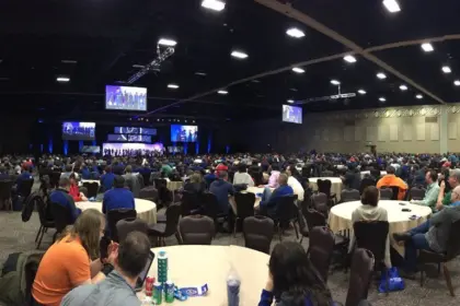
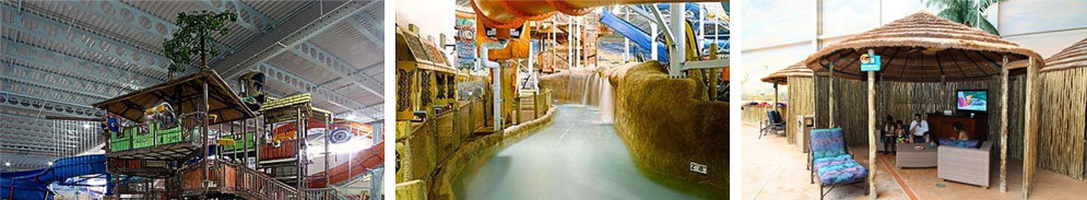
I needed some inspiration, so I went to Google’s image search. One of the things that makes the conference cool is that its held at a huge indoor waterpark called Kalahari, in January ... in Ohio. (it's cold) Kalahari has it’s own faux African theme going and I ended up focusing on that feel.
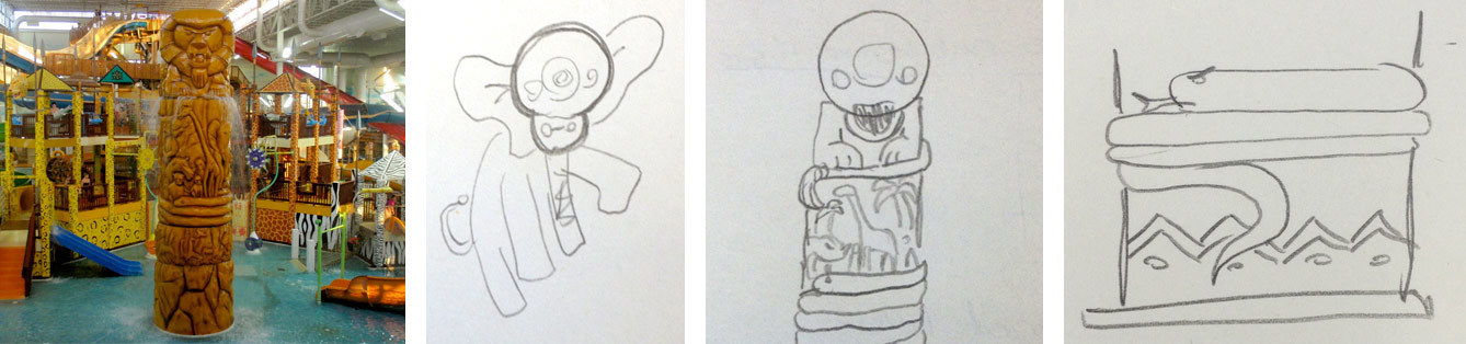
Combining the Logos
Early sketches revolved around how I could combine the Codemash logo with the elephant logo. Then I found this photograph of an african totem pole which they have in the water park. This would become my primary inspiration. It had the elephant and that snake wrapping around to separate the safari images.
Now it was into Illustrator to turn this sketch into a t-shirt. Codemash is a pretty big conference and printing up thousands of t-shirts is expensive so I was limiting myself to one color to keep the price down. I’ve also been a huge fan of the vector work Ryan Putnam has been doing for Dropbox and it’s a style that would work well as a single color screen print.
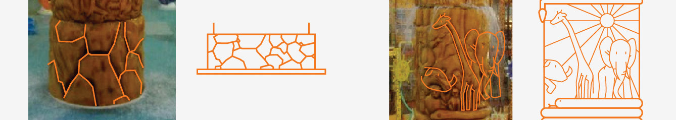
Tracing the Totem
I was having a hard time getting the animals and rocks from the pillar to look right so I traced the photo. I think that worked out well for the rocks but the animals just weren’t working.
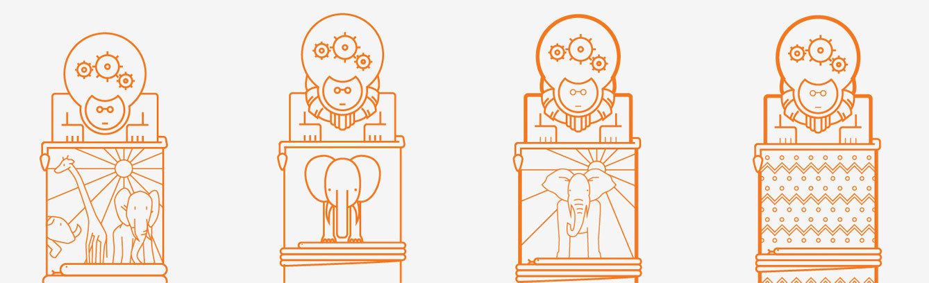
The Elephant
In version 2 I went for a more geometric elephant. It felt to me that the elephant was competing too much with the logo head of the statue so I played with line weights and a new elephant that looks more like the Kalahari logo. The elephant was still competing with the mascot, so I tried a variation without the elephant. Looks okay, but elephants rule so it’s staying.
Elephant Version
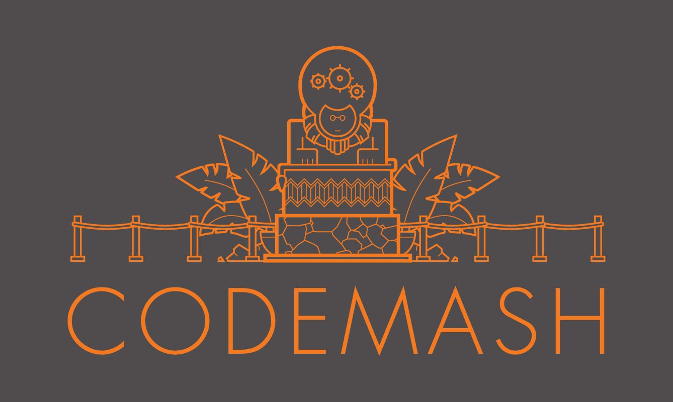
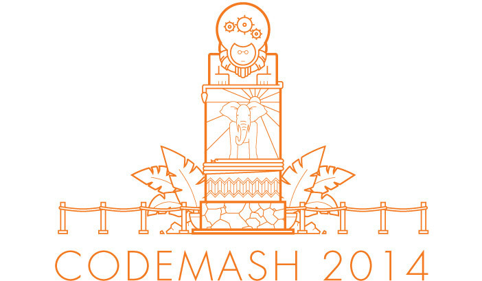
The illustration was starting to feel solid. I added some decoration around the pillar so the conference name would look balanced on the shirt. The type is set in Futura because like Codemash, it’s from the future.
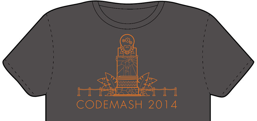
Design on the Shirt
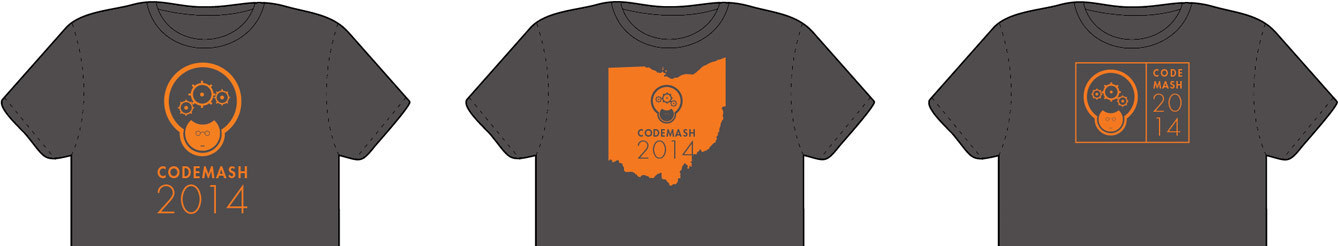
Time to look at the design on a shirt template (I think I got the shirt template from Threadless, but it was a long time ago and I'm not sure anymore.) It’s too tall, time to make it more compact. This meant it was time to go all Godaddy on the shirt by killing the elephant. This broke my heart a little since this whole thing started with me trying to get the elephant on the shirt, but it did solve the problem of the elephant competing for attention with the mascot.
After making the the line thicknesses more consistent this is how the final illustration looks.